Thanks for your feedback!
EDIT
Dashboard is the first screen under the Analytics menu. It offers a general view of the performance of your APIs.
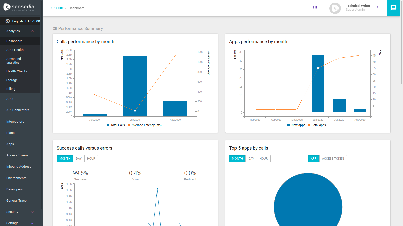
You can see eight different charts on the Dashboard, and they are detailed below.
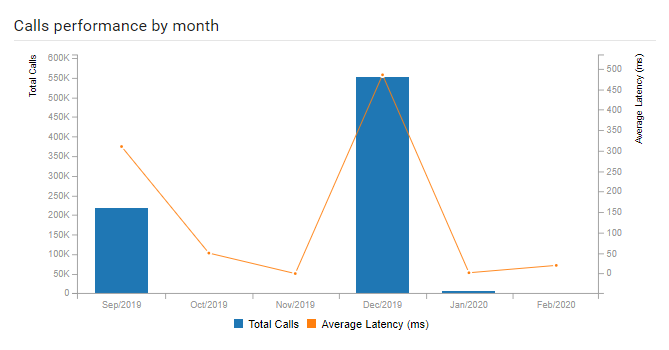
This graph represents number of calls by month and gathers six months of data. There are two visible pieces of information: total calls (blue bars) and average latency (orange line) in milliseconds.
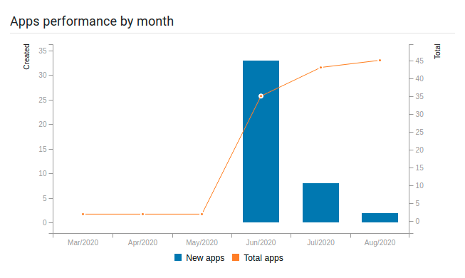
This graph represents the number of apps created by month compared to their existing total (on the Manager).
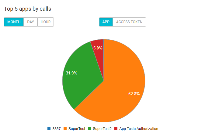
This pie chart represents the five apps or access token with the largest number of calls (to be selected by clicking the upper right corner buttons). The chart returns data from the last 30 days (month) by default, but you can change visualisation to the last 24 hours (day) or the last 60 minutes (hour), by using the upper left corner buttons.
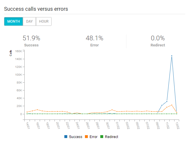
The chart returns the success, error and redirect rates of the calls made within a given period. Again, the default view is of the last 30 days, but you can change de visualisation by clicking the appropriate button.
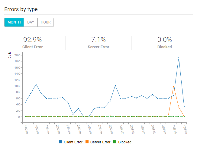
The chart displays a categorisation of call errors by type: client, server or blocked content errors. The lines represent the quantity of error and you can see the percentage of each error regarding the total. You can also choose between three time spans (last month, day, or hour).
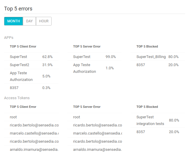
For each type of error mentioned on the last chart, the Top 5 errors figure shows the five most common errors. On its upper section, you can see the five types for apps, and the top 5 access token errors are below. As with the previous charts, you can switch visualisation between last month, day, or hour.
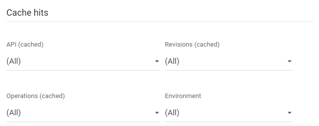
This is a customisable chart showing the quantity of calls with cache access for a given time span and discriminating between cache hits and misses. You can see the data from the last month, day or hour.
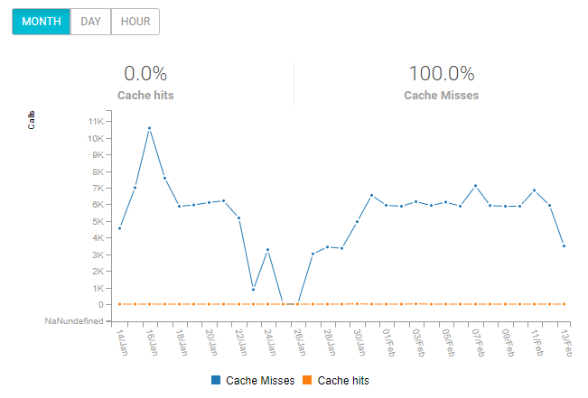
Also, you can filter the data by a specific cached API, revision, HTTP operation and deployment environment. By default, the data are return unfiltered, referring to all cached APIs.
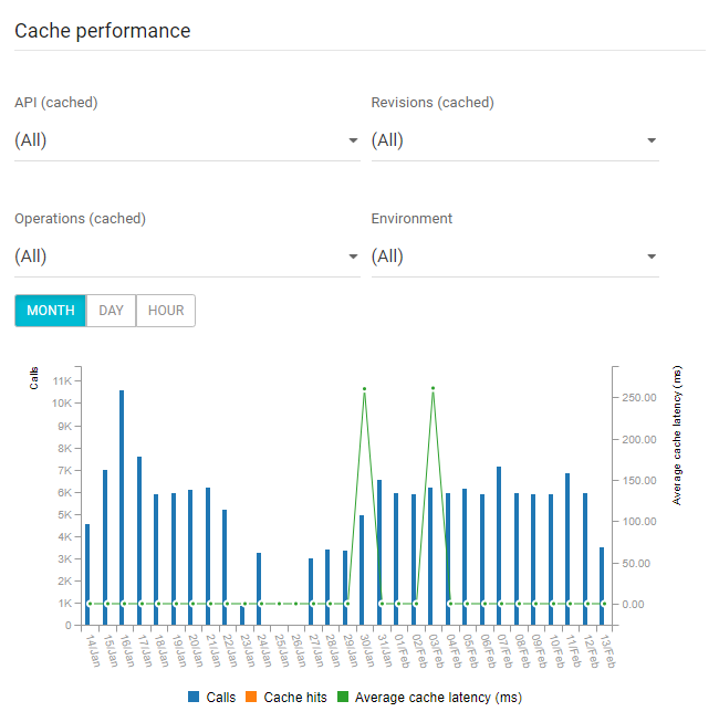
The last Dashboard chart brings a summary of cache performance. The blue bars represent the total number of calls to the cache, the orange line displays the hits, and the green line shows the average cache latency (in milliseconds).
The same selections of the previous chart apply here: you can choose to view the data referring to the last month, day or hour, as well as filter them by API, revision, operation or environment.
Share your suggestions with us!
Click here and then [+ Submit idea]