Thanks for your feedback!
EDIT
Implement your visual strategy and personalize your Developer Portal with Appearance. You can easily define images, font and colors for main interface elements.
At the top of the page there is the link to see how your portal looks with the changes. Remember to first save your changes and, after accessing the link, refresh that page by pressing F5 or by clicking the correspondent icon in your browser.
You may experiment as you wish. If you don’t like the result, click RESET APPEARANCE and you have the initial configuration back.
You also have the option to DISCARD CHANGES so that the changes made after the last save are discarded.
Upload the images that will compose your visual identity.
Hover over the image to see the + button and click it to upload an image.
The table below shows the images that can be customized, their maximum resolution, accepted file formats and size limit.
| Image | Maximum resolution | Accepted formats | Size limit |
|---|---|---|---|
Default logo |
- |
JPG, JPEG e PNG |
1 MB |
Favicon |
32 x 32 |
||
Home page banner |
3000 x 1200 |
||
Catalog banner |
3000 x 1200 |
||
Apps banner |
3000 x 1200 |
You can choose the fonts used in headers and body. The available fonts are:
Roboto
Inter and
Nunito
The sample text next to the font name immediately reflects your choice.
Choose background colors for your Developer Portal header, body and footer.
You may inform the hexadecimal, RGB or HSL code or pick the color from the color palette. You can see an exemple of the font with the chosen colors next to the field with the hexadecimal code.
Even when you choose a color from the palette or enter the color’s RGB or HSL code, the field will always display the hexadecimal code.
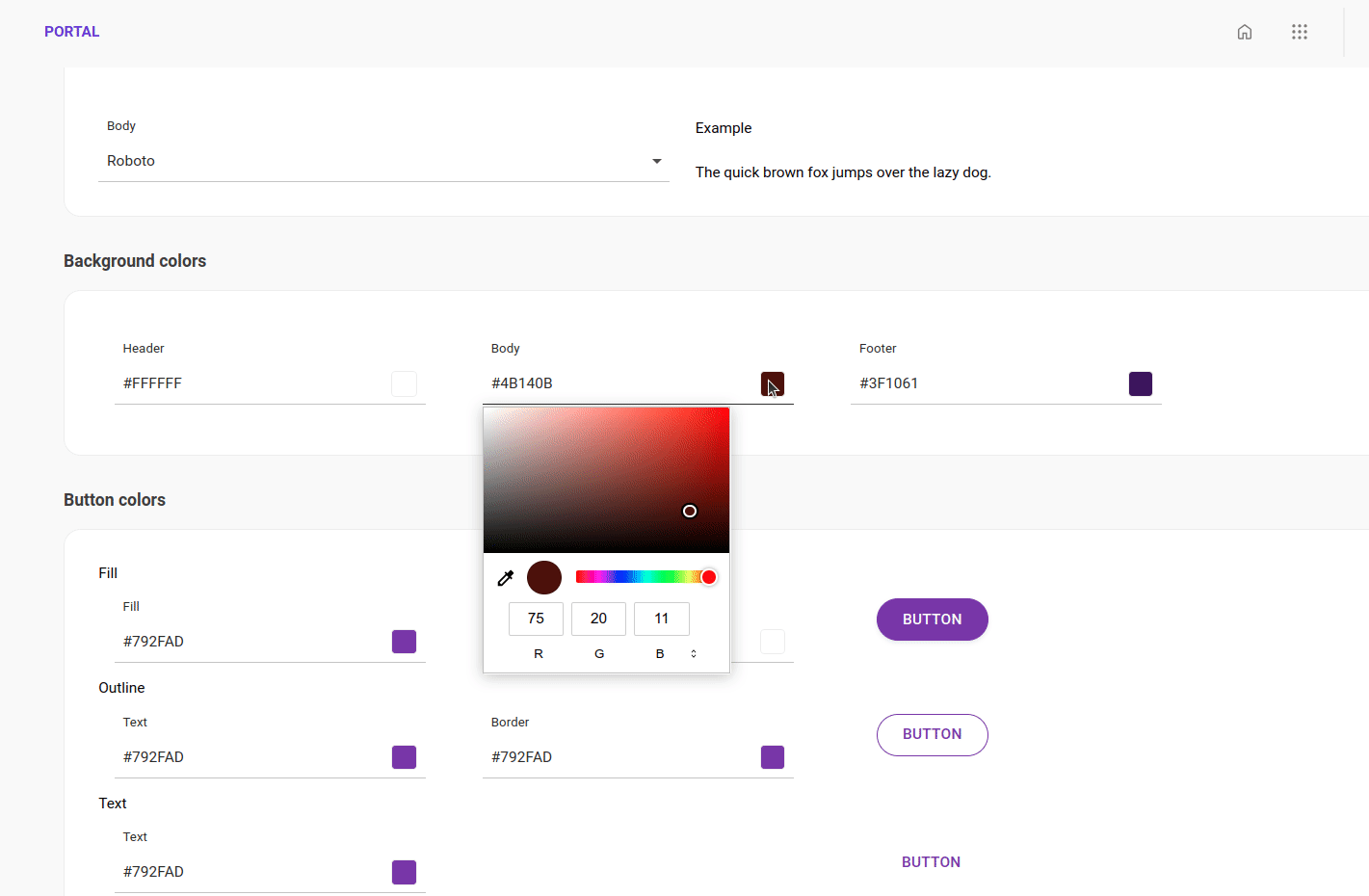
Check below the accessibility tips for contrast recommendations and choose colors for the buttons:
Fill: These are the buttons that have a solid background. Choose a color for that background and for the font.
Outline: These buttons always have a white background. Choose font and outline color.
Text: This type of button has no outline. Choose the font color.
Make your page more pleasing to the eye and easier to read by using high contrast colors.
High contrast is essential for optimal visibility and legibility for individuals with diverse visual abilities.
One of the tools recommended by the W3C (World Wide Web Consortium) and WAI (Web Accessibility Initiative) is this automatic contrast checker:
Inform the colors (Foreground and background color) and see if the colors receive "Pass" (it complies with accessibility recommendations) or "Fail" (it is recommended to choose other colors).
Share your suggestions with us!
Click here and then [+ Submit idea]