Thanks for your feedback!
EDIT
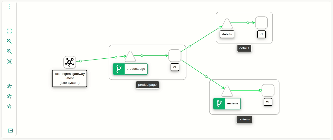
The page Graph offers a real-time customisable graph that provides a synthetic view of several parameters of a mesh. Built on top of Kiali, the graph shows the interaction between services that comprise a mesh from many visualisation options, composing a graphical representation that is suited to the needs of each user.
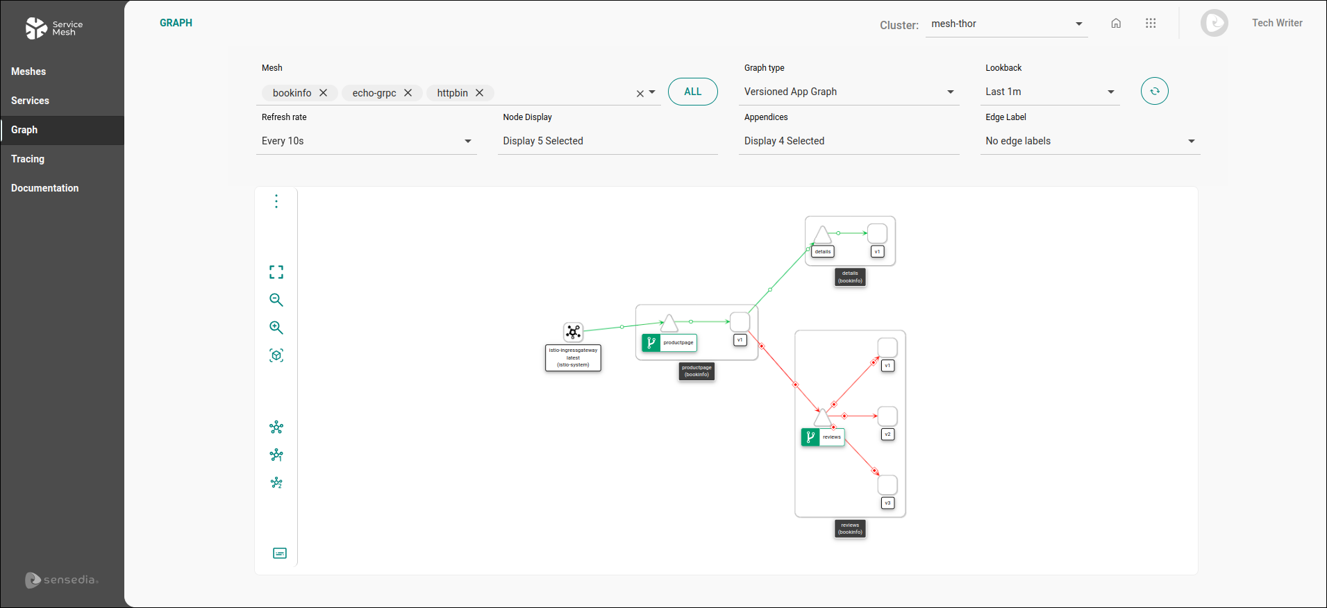
The graph allows you to gauge quickly what is happening on your cluster. For example, you can see the ingress of external requests, which service versions are deployed, which protocol connects services (HTTP or gRPC, for instance), and check useful statistics (such as the percentage of successful requests, among others).
| You can select the cluster you want to operate in the Cluster: field, located in the upper right corner of the screen. |
| To view the graphs, you must have the Read Graph permission enabled in Sensedia Access Control. |
| For the graph to exhibit information, the services must propagate OpenTracing headers. You can read more about it on the page about the Tracing screen. |
The selection fields above the graph control a range of visualization parameters.
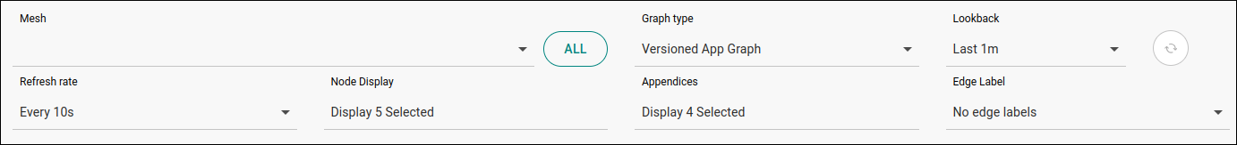
Mesh: select the mesh you wish to visualize. You can select more than one at once. The ALL button, located to the right of this field, allows you to select all the meshes available in the cluster at once.
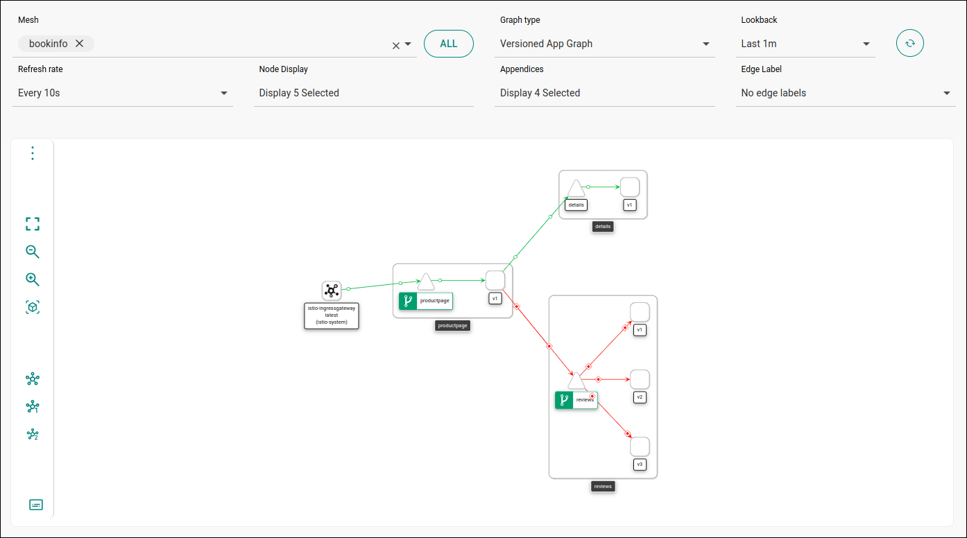
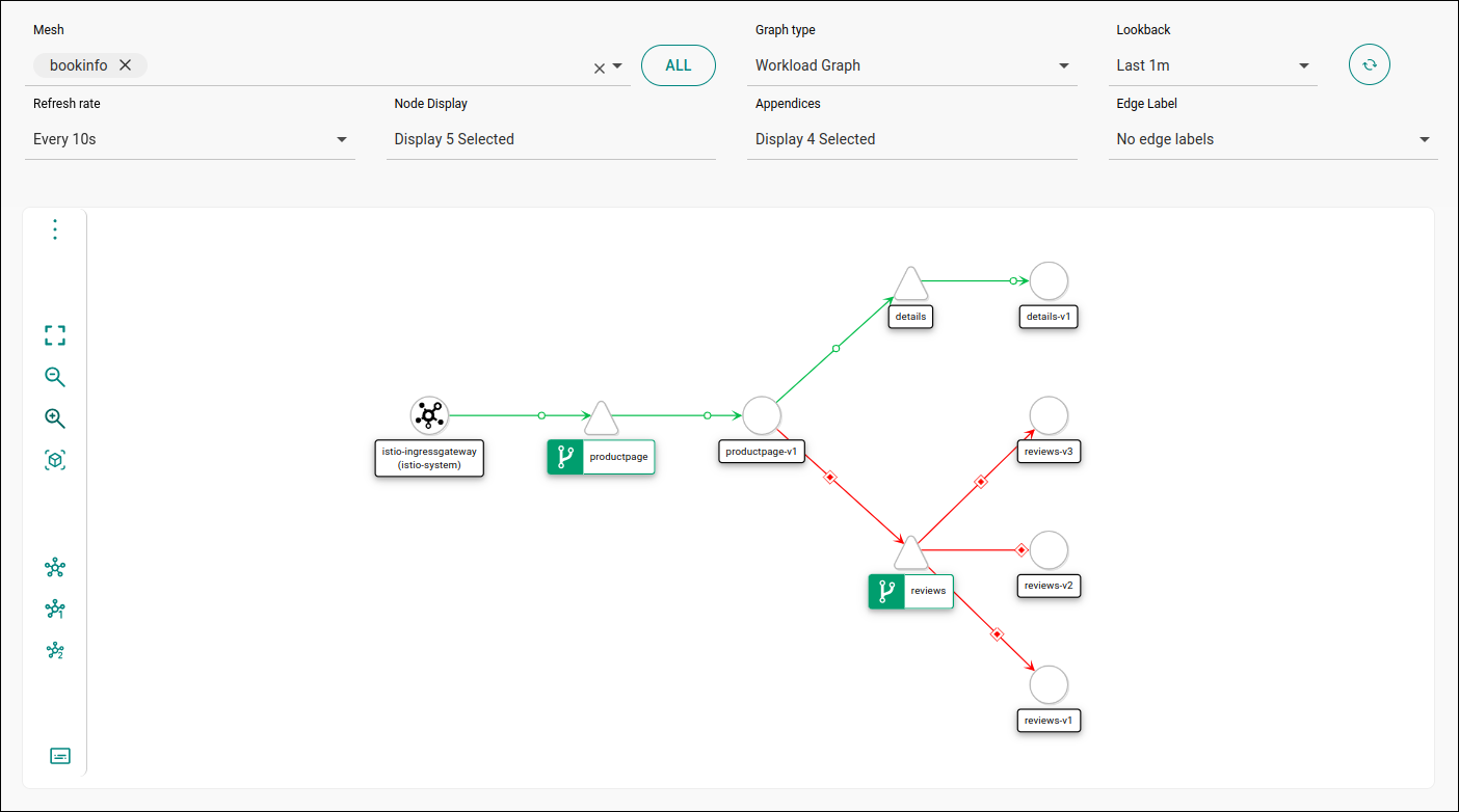
Graph type: select the graph type. Read about the types available below.
Lookback: time to be considered for the exhibition of information. Options: last minute, last 5, 10 or 30 minutes, last hour, last 3 or 6 hours. The present moment is always the end-date. That means that there will be no graph generated for a mesh that is not receiving requests at the moment.
Refresh rate: the frequency with which the information exhibited is updated. Options: every 10, 15 or 30 seconds, every minute, every 5 or 15 minutes. It’s possible to pause the update by selecting the Pause option.
Next to the Lookback field there is a button to refresh the info manually ( ).
).
Node Display: select information to be displayed. Read about the options below.
Appendices: additional display options. Read about them below.
Edge Label: field to select the type of value that will be shown along the edges that represent the interaction between components. Options: no label, requests per second, percentage of requests, response time.
|
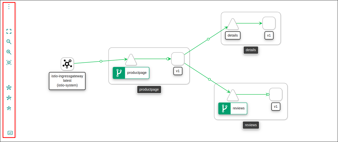
It’s worth clarifying the usage of the term node on the Graph screen. On other pages of Sensedia Mesh, node is used as concept linked to clusters, meaning a virtual or physical machine that contains container pods. The Graph page, however, uses it as it appears in graph theory or network analysis, meaning an item, a specific entity that can be represented graphically. Thus, a node may change depending on the granularity that is chosen for a graph. In our case, a node can be a service, a workload or an application. In turn, the lines that show the communication between nodes are commonly called edges. |
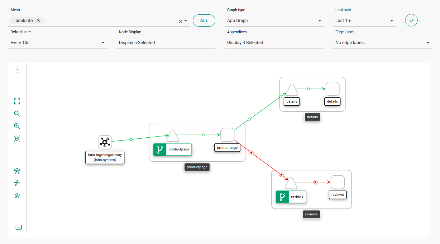
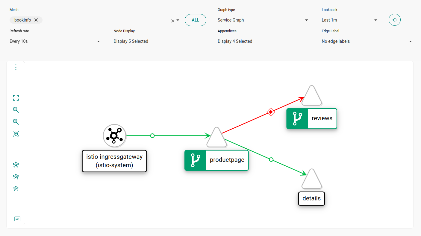
There are four different graph types, each offering a distinct view of mesh traffic.
App Graph: displays workloads aggregated by application.
Service Graph: displays service traffic.
Versioned App Graph: displays the same information as the App Graph, but showing the different versions of an application, with traffic information regarding each version.
Workload Graph: displays traffic between workloads without delimiting services and applications.
The Node Display field allows choosing what information the graph will show:
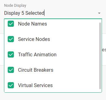
Node Names
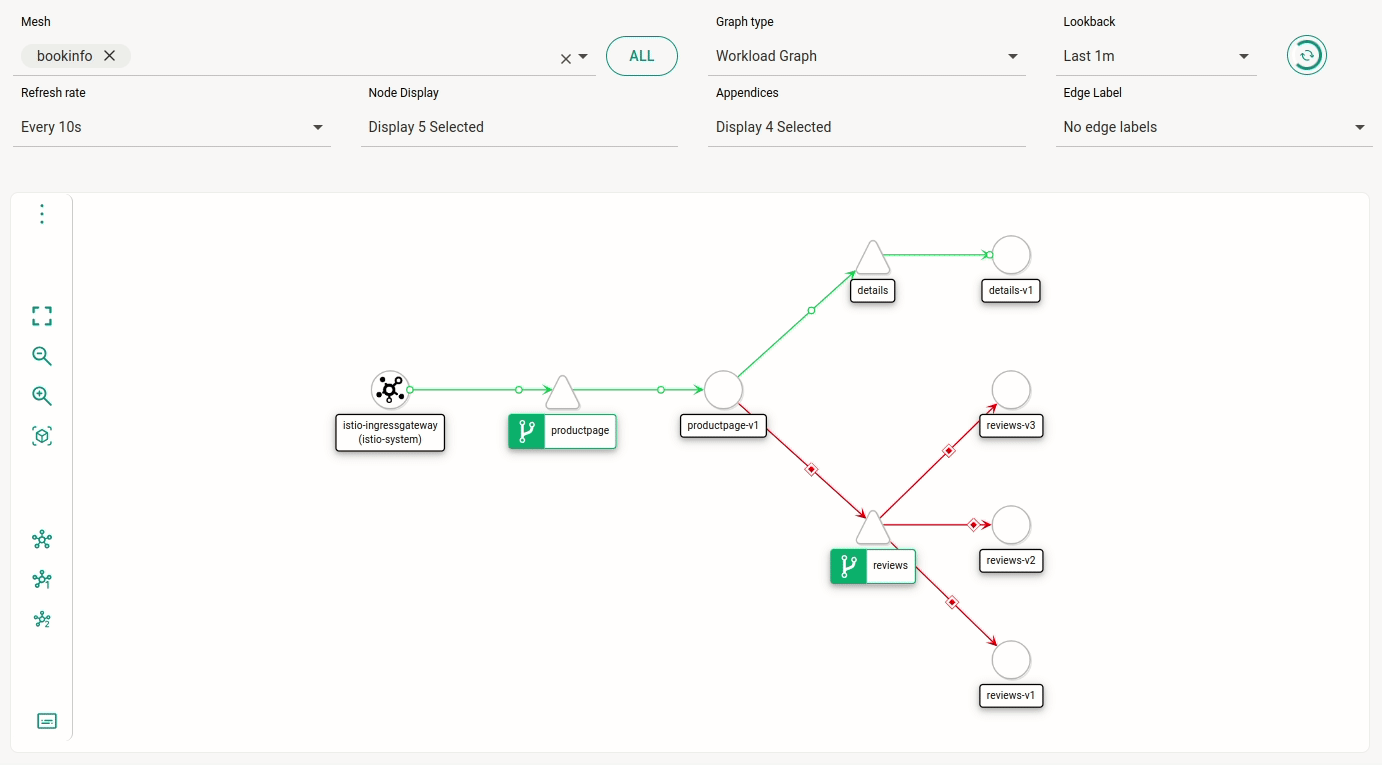
Service Nodes: the shapes that delimit nodes have meaning: squares represent applications, triangles represent services, circles represent workloads, pentagons represent services specified manually as Service Entry (an Istio object; read more about it on their documentation) and losanges represent unknown nodes (which may be due to a source external to the mesh — that is not istio-ingressgateway — or a node that has not received a sidecar properly installed).
Traffic Animation: read more about traffic animation below).
Circuit Breakers: adds an icon ( ) to services configured with circuit breakers.
Virtual Services: adds an icon ( ) to services configured as virtual services.
When animation is set as a display option, HTTP requests are shown with a representation of success/error: green circles represent successful requests and red losanges represent error HTTP status.
If all requests are successful, the edges will be green. Yellow edges mean that some requests (up to 20%) have error. If more than 20% of requests have error, the edges will be red.
For TCP connections, the edges are blue and offset circles represent requests. The faster the circles move along the edges, the faster the traffic.
In addition to Node Display options, the field Appendices offers these items:
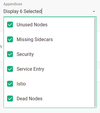
Unused Nodes: nodes that have never received traffic will be displayed.
Missing Sidecars: services without a sidecar will be identified by the icon  .
.
Security: graphical representation for mTLS on edges. This option is unselected by default, since it increases rendering time. When selected, it displays a lock that is either open or closed, following this behaviour:
If mTLS is configured globally, there will be a closed lock for the mesh and open locks for the edges in which any percentage requests is not mTLS.
If mTLS is not configured globally, there will be a closed lock on edges with mTLS requests (any percentage higher than 0%).
Service Entry: graph will display a node for ServiceEntry components.
Istio: the graph will display Istio components, such as VirtualService.
Dead Nodes: if selected, this option will remove from the graph any node that is not receiving traffic or has configuration error.
In addition to the fields that control display options, the graph contains a menu with additional features to its left.
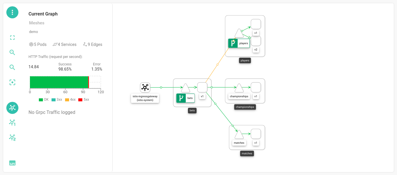
The icon  opens a graph summary:
The icon  controls full screen mode.
 ,
,  and
and  control zoom.
The three icons
control zoom.
The three icons  change graph layout:
|
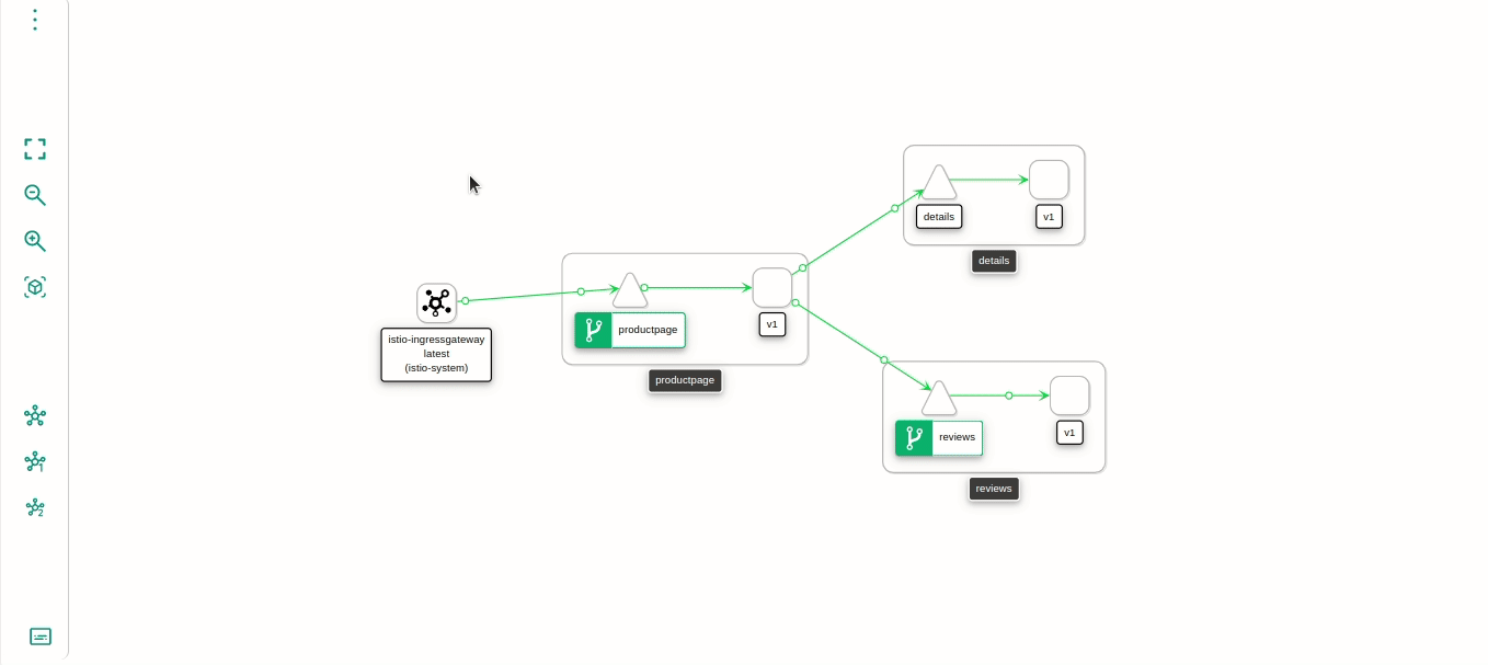
In addition to these layout options, the graph is interactive. You can move components around and focus on them by double clicking: 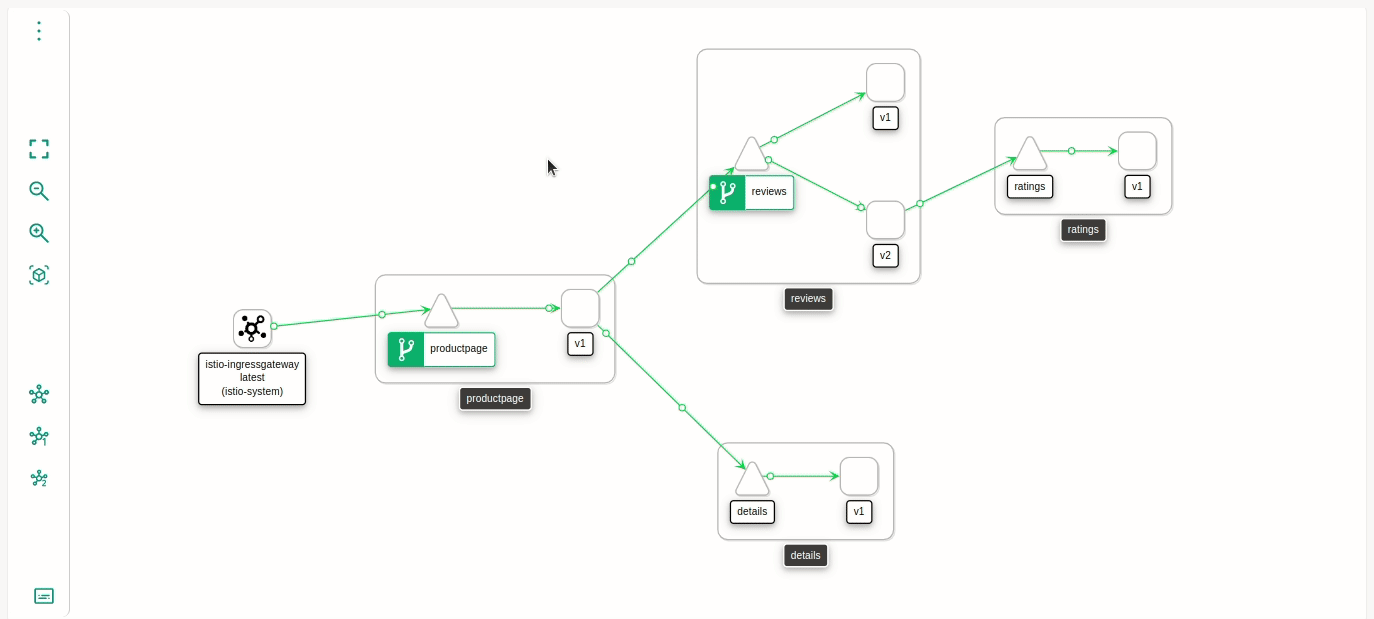
|
Finally,  displays a legend clarifying shapes and colours:
Share your suggestions with us!
Click here and then [+ Submit idea]